zoominfo

The Evolution and Benefits of Dashboards


How have dashboards evolved over time?

We hear dashboards are on their way out. I recently saw a tombstone for Dashboards on TDWI’s thought post (good read, btw!). Try a Google search for “dashboards 2021” and you may find many references that say dashboards are becoming obsolete. Sirius maintains, however, that dashboards have simply been upgraded. Quality data visualization for business intelligence dashboards helps businesses make money. The function of data visualization and continuous data curation allows for deeper insights and predictive measures, helping businesses make better decisions and create improved business performance. Old dashboards, perhaps, were clunky, took time to build and maintain, and changes were slow and expensive. But, the evolution of analytical dashboards now allows for businesses to quickly analyze data and run better.


The ultimate dashboard feature: Data visualizations

For our clients, our data visualization tools allow clients to understand their financial data sources at deeper levels and make improved business performance decisions with that data. Our work typically provides data specificity – relevant, precise data around distinct categories.  Our clients have insights around revenue, costs, and profitability around each client, department, solution or products they sell, and even employees or offices.


Benefits of data dashboards

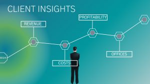
This level of specificity leads to data being utilized to develop market insights, analyze cost structures or service models, and operate in ways that improve profitability. Paired with data modeling and machine learning, we are able to build organizations that are truly driven and guided by data and analytical dashboards.


Improved Business Intelligence


The availability of real-time, integrated data has changed the future of dashboards. Dashboards are only as efficient or value-adding as the data that feeds them. It is important to remember this. Ultimately, data visualization in dashboards should result in improved business intelligence, collaboration, and communication right across an organization. A causal sequence of getting a business’s data to talk results in better conversations, synergies, strategies, consensus, and overall business metrics and efficiencies.


Real-Time Dashboard Example

The data visualization of the pandemic is perhaps a good testimony to our purpose here. At the beginning of the pandemic, in mid-2020, people across the globe visited the Johns Hopkins Coronavirus Research Center to get daily reports on the spread and effects of COVID. Soon, the Gates Foundation, MIT, and several other organizations built data models to translate and predict COVID-related situations based on this high-quality, accurate raw data reporting. Soon after, social media platforms had groups curating the data and collaborating to bring together data, dashboards, decision making, social and health policies, improved data visualization, predictive modeling, discussions, and collaboration to have a world that collaborated around a simple dashboard.


John Hopkins Coronavirus Research Center – Dashboard Snapshot, February 24, 2022


In Summary

Data is powerful, and how data is consumed, made intelligent, and shared is perhaps as important as the data itself. “Dashboard Intelligently”, which to us means a combination of data visualization, consumption, collaboration, and decision making, will remain our mantra for 2022.

As a testimony to the increased value of data visualization and dashboards, startups and data visualization software providers continue to gain ground. Here is a helpful link for companies trying to find deeper meaning in their data.


Rakhee Das, Chief Strategy Officer – Sirius Solutions


Contact Sirius Solutions at Solutions@Sirsol.com or complete the form below to learn more about our client successes with dashboards and how to get started on the right path with your own dashboard.

[contact-form-7 id=”227245″ title=”Contact Us”]